Responsive vs Adaptive Design: Which is Right for You?
Share this to
Table of Content:
- Responsive Design: Adapting to All Screens
- Adaptive Design: Tailored for Specific Devices
- Choosing the Right Approach
- Conclusion
In today's digital age, having a mobile-friendly website is no longer optional – it's a necessity. With the ever-increasing variety of devices and screen sizes, web designers face the challenge of ensuring a seamless user experience for all visitors. Two popular approaches to address this challenge are responsive design and adaptive design. But which one is right for you? In this article, we'll break down the differences between responsive and adaptive design to help you make an informed decision.
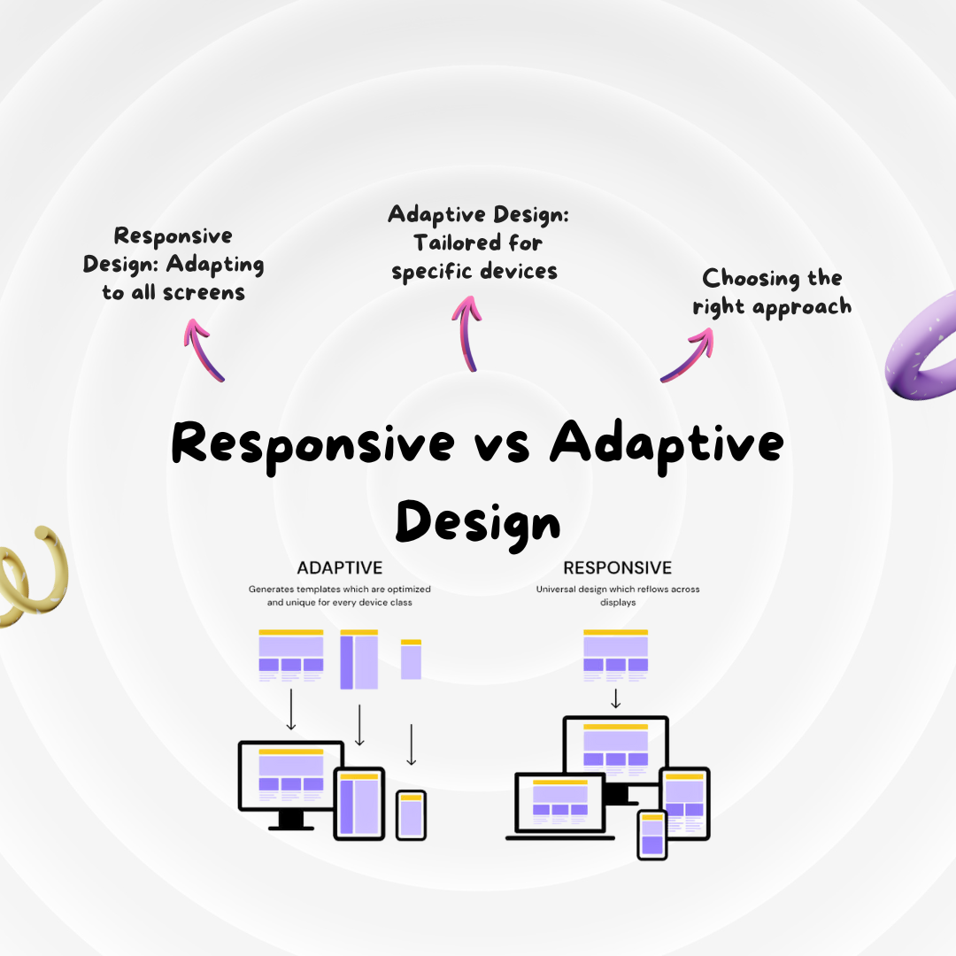
Responsive Design: Adapting to All Screens
Responsive design is a flexible approach that involves creating a single website that automatically adjusts its layout and content to fit the screen size and orientation of the user's device. Here are some key features of responsive design:
-
Fluid Grids and Media Queries: Responsive design uses fluid grids and media queries in CSS to ensure that page elements like text, images, and navigation adapt proportionally to the screen width.
-
Single Codebase: With responsive design, you maintain a single codebase for your website, making it easier to manage and update.
-
Improved SEO: Search engines like Google prefer responsive design because it provides a consistent URL and HTML across all devices, improving your site's search engine rankings.
-
Better User Experience: Responsive design aims to provide a consistent and user-friendly experience across various devices, making it a suitable choice for content-driven websites like blogs and news sites.
Adaptive Design: Tailored for Specific Devices
Adaptive design, on the other hand, involves creating multiple versions of a website, each optimized for specific device categories or screen sizes. The server detects the user's device and serves the appropriate version of the site. Here are some key features of adaptive design:
-
Highly Tailored Experience: Adaptive design allows for a highly customized experience for each device category, optimizing performance and usability.
-
Optimized Performance: Since the content is specifically tailored to each device, adaptive design can potentially offer faster load times, making it suitable for complex web applications.
-
Complex Development and Maintenance: Developing and maintaining multiple versions of a website can be more complex and time-consuming than responsive design.
Choosing the Right Approach
Now that you understand the basics of both responsive and adaptive design, how do you decide which one is right for your project? Here are some factors to consider:
-
Project Requirements: Consider the complexity of your project. If you need to provide a highly tailored experience for specific devices or if your site has complex functionalities, adaptive design may be the better choice.
-
Budget: Responsive design is often more cost-effective since it involves maintaining a single codebase. Adaptive design can be more resource-intensive due to the creation and maintenance of multiple versions.
-
Technical Resources: Do you have the technical expertise and resources to create and maintain multiple versions of your website? Adaptive design may require more development and ongoing effort.
-
Target Audience: Consider your target audience's devices. Are they primarily desktop users, or do they use a variety of devices? Ensure your design aligns with your audience's habits.
Conclusion
Responsive and adaptive design both have their strengths and considerations. The right choice for your project depends on your specific requirements, budget, technical capabilities, and target audience. Some websites even employ a hybrid approach, combining elements of both responsive and adaptive design to meet their unique needs.
In the end, the goal is the same: to provide a user-friendly experience across all devices. By carefully considering your project's needs, you can make an informed decision and ensure your website looks great and functions smoothly, no matter how your visitors access it.
Remember, the digital landscape is continually evolving, so stay up-to-date with the latest trends and technologies in web design to keep your website competitive and user-friendly.
Share this to